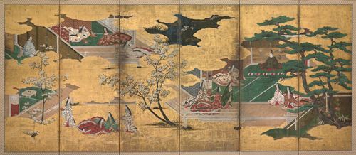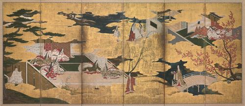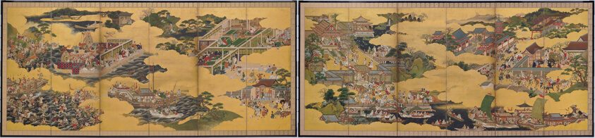
The Tale of Taishokan
Unknown artist · 1640-80
Palette
Sand
Taupe
Tan
Fawn
Smoke
Khaki
Colours measured by this site from the museum image (k-means in CIELAB). Names are the nearest in our own list and describe how the colour looks, not the pigment. Text on each chip uses whichever of black or white contrasts more (WCAG ratio shown). How
Details
- Artist
- Unknown artist
Japanese - Date
- 1640-80
- Type
- Painting
- Medium
- Pair of six-panel screens; ink, colors, and gold on paper
- Size
- Each: 173 × 374 cm (68 1/8 × 147 1/4 in.)
- Place
- Japan
- Period
- 17th century
- Main colour
- Gold & ochre · lightness 54, colourfulness 24
Art Institute of Chicago, Restricted gift of Charles C. Haffner III and Muriel Kallis Newman; Alyce and Edwin DeCosta and Walter E. Heller Foundation Endowment; through prior gift of Charles C. Haffner III. Museum record.
Public domain: the museum's is_public_domain field read true when we last checked (2026-11-01); image released under CC0.
Licence rules