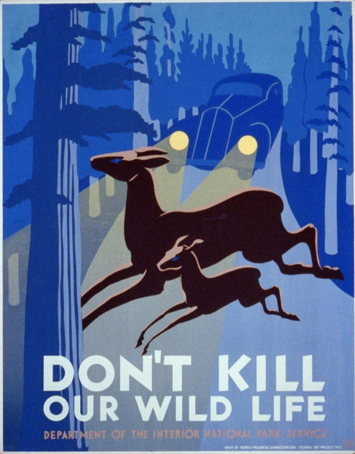
Don't kill our wild life
Unknown artist · [Federal Art Project, [between 1936 and 1940]
Palette
Colours measured by this site from the museum image (k-means in CIELAB). Names are the nearest in our own list and describe how the colour looks, not the pigment. Text on each chip uses whichever of black or white contrasts more (WCAG ratio shown). How
Details
- Artist
- Unknown artist
- Date
- [Federal Art Project, [between 1936 and 1940]
- Type
- Medium
- 1 print on board (poster) : silkscreen, color.
- Place
- NYC
- Period
- 20th century
- Main colour
- Blue · lightness 44, colourfulness 32
Library of Congress, Library of Congress, Prints and Photographs Division. Library record. Public domain. United States: US federal government work (17 U.S.C. 105): item.created_published: "NYC : Works Progress Administration, Federal Art Project, [between 1936 and 1940]". Not applicable: a US government work. Last checked 2026-10-31 (rights statement says no known restrictions: yes). Image: Library of Congress, Prints and Photographs Division; no known restrictions on publication. Licence rules